How Much Website Do You Actually Need?
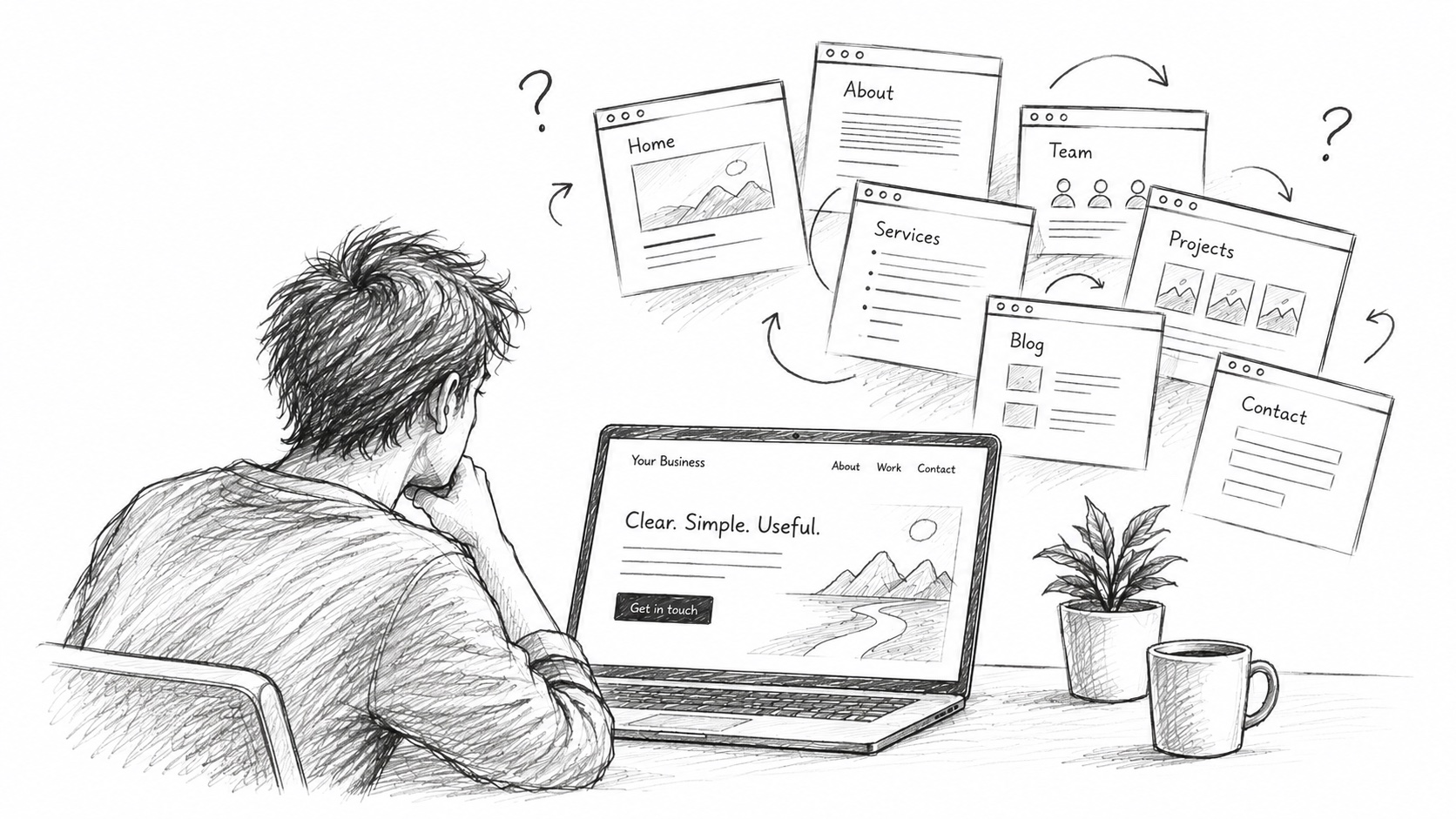
From time to time, I want to learn about some business. So I’ll open their website, and more often than I’d expect, the website won’t really explain what they do. Making matters worse, it might have a whole bunch of sub-pages, each explaining some small part of what they offer. Yet not a single page gives me a decent overview of the business as a whole.
That’s a problem, because people generally don’t spend much time trying to figure a website out. The Nielsen Norman Group found that users often leave web pages within 10–20 seconds. To keep them around, they recommend communicating your value proposition within the first 10 seconds.
For a small service business, I think a good company website basically has to do three things:
A) explain what the customer gets out of what you offer, or which problem you solve for them
B) give the customer a reason to believe that you can actually deliver it
C) get the customer to take the next step, usually by contacting you
That’s obviously not some scientific formula, but there is some research behind it. Nielsen Norman Group describes the perceived value of a website as the benefit users expect to get from it, and argues that this initial perception strongly influences whether they engage with the site at all. Stanford researchers had 2,684 people evaluate real websites and found that visual design was the most frequently mentioned factor when judging their credibility. And if you want the visitor to actually do something afterwards, the next step needs to be clear as well: Nielsen Norman Group specifically recommends clear calls-to-action with enough information for users to understand where they lead.
The reality is that many individuals and small businesses don’t need a complicated website. In plenty of cases, one good landing page plus the legal pages you need is already enough. Once the three points above are checked, you’re basically done.
A category that often does this very well is personal and portfolio websites. Those usually have one main page, often look distinctly different from everything else, and that’s about it. Maybe add a blog and some legal stuff. The good ones still make it immediately clear who the person is, what they do, what they’ve done and how you can reach them. They manage to stand out without making the website itself difficult to understand.
And those two things are actually quite different. Google researchers found that people generally prefer websites with lower visual complexity and designs that roughly match what they already expect from that kind of website. These first impressions can form within just a few dozen milliseconds. So you can absolutely make a website look distinctive without making its structure complicated.
Of course, sometimes you still need more pages. If you have several genuinely different services, different audiences, lots of information to explain or content that people specifically search for, splitting things up can make the website easier to understand. And cramming absolutely everything onto one gigantic landing page isn’t simple either.
The point isn’t really to have as few pages as possible. It’s to have as much website as you actually need.
So whenever you build one, try to keep it simple. Start with what the customer gets out of your offer, why they should believe you can deliver it, and what you want them to do next. Then add things when they have an actual purpose.
Usually, that also means the website is faster to build, cheaper to maintain and easier to understand.